Blog
Why Responsive Websites Matter for Restaurants: Boost Customers & Experience
Discover why responsive websites are essential for restaurants. Learn how mobile-first design boosts customers, conversions, and Google rankings in 2026.

Why Responsive Websites Matter for Restaurants: Boost Customers & Experience
TL;DR:
- Responsive websites automatically adapt to all devices, increasing customer engagement and sales.
- Mobile-first design improves SEO, reduces bounce rates, and minimizes revenue loss.
- Proper implementation avoids common responsive design pitfalls, enhancing user experience and performance.
If your restaurant’s website doesn’t work perfectly on a smartphone, you’re losing real customers and real money right now. Non-responsive sites lose $12B in sales annually, and most of that loss hits local businesses that assume their desktop site is “good enough.” Responsive design isn’t a buzzword reserved for tech companies. It’s the difference between a diner finding your menu in 10 seconds and bouncing to your competitor across the street. This article breaks down exactly what a responsive website is, why it directly affects your bottom line, and what you can do about it starting today.
Table of Contents
- What is a responsive website and why it matters
- Key benefits: More customers, conversions, and revenue
- How responsive design works: Technical essentials explained
- Common pitfalls and advanced strategies
- A restaurant marketer’s take: Why mobile-first wins the customer
- Enhance your restaurant’s site: Next steps with Sorbey
- Frequently asked questions
Key Takeaways
| Point | Details |
|---|---|
| Drives more customers | Responsive sites boost your Google visibility and attract customers searching on their phones. |
| Prevents lost sales | Non-responsive websites cause customers to abandon your site and cost you revenue. |
| Mobile-first is critical | Designing for mobile devices first ensures the best customer experience and business performance. |
| Avoid common pitfalls | Test on real devices and ensure menus, images, and calls-to-action are touch-friendly. |
What is a responsive website and why it matters
A responsive website is a single site that automatically adjusts its layout, images, and text to fit any screen size, whether that’s a 27-inch desktop monitor, a tablet, or a 6-inch smartphone. One URL. One set of content. Zero guesswork for your customer.
Here’s the common misconception: many restaurant owners think they’re covered because they have a separate mobile site or an app. But separate mobile sites create duplicate content problems, require double the maintenance, and often show outdated or incomplete information. Apps require downloads most people won’t bother with. A properly responsive site covers every device automatically.
For restaurants specifically, this matters more than almost any other industry. People search for places to eat while they’re already out and hungry. They’re standing on a sidewalk, checking menus, looking at hours, and deciding where to walk in the next five minutes. If your site takes 10 seconds to load or forces them to pinch and zoom to read your menu, they close the tab.
Studies show 53% of diners check menus from a mobile device before visiting. And 73% of users abandon sites that aren’t mobile-friendly. That’s not a fringe audience. That’s the majority of your potential customers walking away.
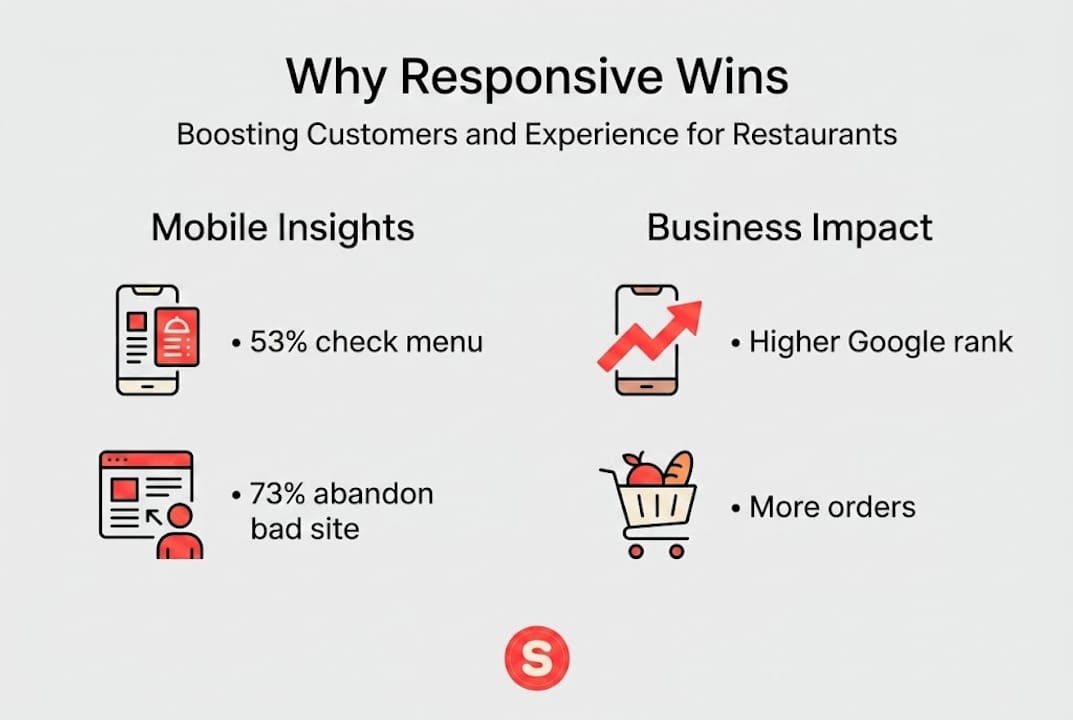
There’s also a search engine angle. Google recommends responsive design over separate mobile sites because it uses a single URL and HTML, simplifying crawling, ensuring content parity, and aligning with mobile-first indexing, where mobile versions determine your actual search rankings. In other words, a non-responsive site doesn’t just hurt user experience. It hurts how visible you are on Google.
Here’s a quick comparison to make this concrete:
| Website type | Cost to maintain | SEO impact | User experience |
|---|---|---|---|
| Responsive | Low (single site) | Strong | Seamless across all devices |
| Separate mobile site | High (two sites) | Weaker (split signals) | Inconsistent |
| Desktop-only | Low | Poor (mobile-first penalty) | Broken on phones |
For any restaurant looking to follow best practices for restaurant websites, a responsive design is the non-negotiable starting point. Everything else builds from there.
Key benefits: More customers, conversions, and revenue
Now that we’ve defined responsive websites, let’s look at the real business impact for your restaurant.
More mobile traffic translates directly into more foot traffic and takeout orders. When your site works well on a phone, visitors stay longer, explore your menu, and actually complete the action you want, whether that’s placing an order, booking a table, or calling you.

Responsive design boosts conversions by 11% while preventing the 73% mobile user loss that plagues non-responsive sites. Those aren’t abstract percentages. They’re real customers choosing your restaurant instead of leaving.
Here’s how responsiveness impacts the key business areas your restaurant depends on:
- Reservations and bookings: A mobile-optimized booking form means fewer abandoned reservations. Customers complete the process without frustration.
- Delivery and online orders: A responsive ordering flow dramatically reduces cart abandonment, which is one of the top revenue leaks for restaurant websites.
- User reviews and reputation: Positive mobile experiences encourage customers to leave reviews. A smooth site visit signals professionalism.
- Google discoverability: Better mobile performance means higher search rankings, putting you in front of customers who don’t already know your name.
“Non-responsive sites lose $12 billion annually in sales” across industries, with local restaurants absorbing a disproportionate share of that loss.
Pro Tip: Open Google Analytics and check your mobile traffic report. Look at bounce rate and session duration split by device. If your mobile bounce rate is 20 or more percentage points higher than desktop, that gap is your revenue leak.
Restaurants that invest in optimizing restaurant websites for engagement consistently report higher table turnover from digital reservations and improved repeat customer rates. The importance of online menus to restaurant growth cannot be overstated, and a non-responsive site buries that menu under a frustrating experience.
| Metric | Responsive site | Non-responsive site |
|---|---|---|
| Mobile conversion rate | +11% improvement | Baseline |
| Mobile abandonment | Reduced significantly | Up to 73% loss |
| Annual revenue at risk | Minimized | Part of $12B lost |
How responsive design works: Technical essentials explained
So what actually makes a website responsive behind the scenes? Here’s enough to evaluate any designer or platform without needing a computer science degree.
The core engine is CSS, specifically layout tools called Grid and Flexbox. These allow a page’s columns, images, and text blocks to reflow and resize automatically based on the available screen width. Instead of fixed pixel widths that break on smaller screens, responsive sites use percentages and relative units that scale proportionally.
Images are handled separately using a technique called "srcset, which tells the browser to load a smaller image file for phones and a larger one for desktops. This keeps load times fast without sacrificing visual quality. Typography is managed with a technique called clamp`, which sets a minimum and maximum font size with fluid scaling in between. Your menu headings stay readable without being comically large on a phone.
The mobile-first approach prioritizes small screens first for better performance, SEO, and content focus, using CSS Grid and Flexbox for layouts, clamp for fluid typography, and srcset for images. Building for the smallest screen first forces designers to keep the most important information front and center.
When you’re evaluating a designer or website platform, here’s what to ask about:
- Mobile-first build process: Did they design for phones before desktops?
- Touch target sizes: Are buttons large enough to tap easily (at least 44 pixels)?
- Menu readability: Does your food menu display clearly without horizontal scrolling?
- Image optimization: Are images sized and compressed for mobile bandwidth?
- Real-device testing: Was the site tested on actual phones, not just a resized browser window?
Pro Tip: Always ask to see the site on a real iPhone and Android device before approving any design. Browser resizing in a desktop window doesn’t expose the real issues that appear on actual hardware.
For a deeper look at what vendors should deliver, reviewing technical best practices for restaurant sites gives you a solid benchmark to hold them to.
Common pitfalls and advanced strategies
Even well-designed responsive sites can stumble without attention to detail. Here are the mistakes that quietly damage your restaurant’s mobile experience.
Classic mistakes to avoid:
- Tiny touch targets: Buttons smaller than 44 pixels are nearly impossible to tap accurately on a phone. Your “Reserve a table” button should never require a precise finger tap.
- Fixed pixel widths causing overflow: Elements coded in fixed pixels push outside the screen boundary on small devices, creating that dreaded horizontal scroll bar.
- Images without explicit dimensions: When a browser doesn’t know an image’s size in advance, the page jumps as it loads. This is called Cumulative Layout Shift (CLS) and it drives users away.
- Untested browser inconsistencies: A site that looks perfect in Chrome may break in Safari on iOS. Real-device testing across browsers catches these before your customers do.
Small touch targets under 44px, fixed pixels causing overflow, and un-dimensioned images causing layout shifts are among the most common and damaging responsive design failures in 2026.
Advanced strategies worth requesting:
- Fluid typography using clamp values so text scales smoothly between screen sizes
- Responsive images with srcset to cut bandwidth usage by up to 50%
- Lazy loading for images below the fold to improve initial page speed
- Preloading critical fonts so text appears immediately instead of flashing
Aim for Core Web Vitals benchmarks of LCP under 2.5 seconds, INP under 200 milliseconds, and CLS under 0.1. Modern responsive design strategies show that hitting these targets directly correlates with higher rankings and better user retention. Responsive images cut bandwidth by 50% and fluid type improves readability by 12%.
If you’re managing your own search engine optimization for restaurants, these performance benchmarks are as important as your keyword strategy. A slow site cancels out good content every time.
Check any responsive web design challenges your current site may already have by running it through Google’s PageSpeed Insights.
A restaurant marketer’s take: Why mobile-first wins the customer
Here’s the uncomfortable truth most web designers won’t tell you: the majority of so-called “responsive” restaurant websites are actually desktop sites that have been squeezed down to fit a phone screen. That’s not the same thing, and your customers can feel the difference.
A real mobile-first site starts with the phone and adds features as the screen gets larger. A desktop-first site stuffed into a smaller frame carries all the visual weight of the original, which means slow load times, cluttered layouts, and buried information.
Pure responsive desktop-scale-down can bloat mobile performance, while true mobile-first progressive enhancement prioritizes core features first and adds complexity for larger screens. That means your menu, hours, and location are always the first things a customer sees, not the last.
For local restaurants, the customer’s mobile journey almost always starts with one question: “Is this place worth going to right now?” Your site has about 8 seconds to answer that. A mobile-first approach to mobile-first strategies for restaurants ensures the answer is always clear.
Pro Tip: Before your next website redesign, open your current site on your own phone and try to find your menu, hours, and phone number in under 15 seconds. If you struggle, so does every customer.
Enhance your restaurant’s site: Next steps with Sorbey
Understanding the problem is the first step. Acting on it is where restaurants actually gain ground on their competition.
Sorbey’s responsive website services are built specifically for local restaurants that want more customers, not more complexity. Every project is built mobile-first, avoiding the pitfalls covered in this article from the start. From fluid menus to fast-loading image galleries, the technical and marketing work happens together. Explore AI-powered restaurant marketing that ties your responsive website into a complete local marketing system, so your online presence works as hard as your kitchen does.
Frequently asked questions
What’s the difference between a responsive and a mobile site?
A responsive website adapts to all screen sizes using the same URL and content, while a mobile site is a separate version built only for mobile devices. Google recommends responsive design over separate mobile sites for SEO and consistency.
How does responsive design affect my restaurant’s Google ranking?
Responsive design improves search rankings because Google’s mobile-first indexing uses mobile versions of your site to determine where you appear in results. A non-responsive site is penalized in local search.
How much business do restaurants lose without a responsive website?
On average, non-responsive sites lose up to 73% of mobile visitors and contribute to $12 billion in annual sales lost across industries. For a local restaurant, that translates to empty tables and missed orders.
What are the most common mistakes in responsive design for restaurants?
Small touch buttons under 44 pixels, images without defined dimensions, and menus that overflow on small screens are the most frequent culprits. These responsive design challenges are avoidable with proper testing on real devices before launch.
Recommended
You might also like

Why Remarketing Is Important for Restaurants
Discover why remarketing is important for restaurants. Learn how to transform one-time visitors into loyal customers and boost your ROI!

Mobile Marketing Strategies for Food & Beverage in 2026
Discover effective mobile marketing strategies for food & beverage in 2026. Engage customers at the right moment and boost your sales!

Digital Advertising How to Get More Restaurant Customers
Discover digital advertising how to attract more restaurant customers. Learn strategies to fill your dining room with effective campaigns.